Strong, recognizable small business logos are one of the most powerful tools in the modern marketing toolbox.
As new technologies, platforms, and marketing channels emerge that logo has to work harder than ever before. That multi-faceted workload requires a logo that is strong and recognizable but that is also flexible with versatility built in.
The digital age has expanded where your small business logo will be seen, often in places traditionally reserved for big business. But the digital era has also changed how your logo will be seen. The options are limitless, so why not start strong and leverage all that modern marketing has to offer?
Whether you’re booking a billboard on the Bedford Highway or adding a profile image on Instagram, those endless options necessitate a versatility in logo design that was not as critical in the past. Here are a few things to think about when assessing the strength of your logo:
Adapting to multiple platforms
The digital age has brought with it an array of platforms where your logo needs to shine. Each platform has its unique requirements:
- Social platforms: On social media, your logo needs to be recognizable even when scaled down to fit into profile pictures or avatars, which are often circle or square in shape. It also needs to retain its impact when viewed on different devices, from smartphones to desktops. Does your logo stand out at 3mm x 3mm?
- Print products: In print, your logo must be adaptable for various sizes and contexts, from business cards to billboards. It needs to maintain its clarity and impact regardless of scale. It should also be available in one-colour to reduce costs.
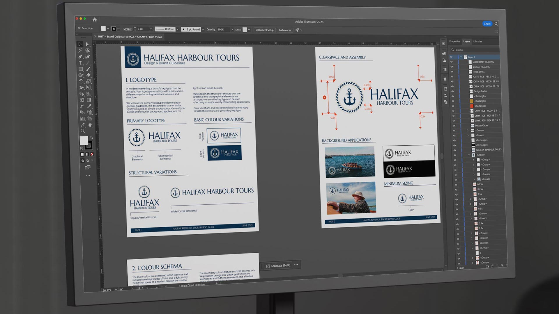
- Websites and digital tools: On websites, your logo not only represents your brand but also often functions as a navigational tool, taking users back to the homepage. Here, it might need to fit into different layouts, such as a wide header or a narrow sidebar.
Variations for different uses
To meet these diverse needs, a logo can no longer be a one-size-fits-all design. It requires variations, such as:
- Square vs. rectangle: Some platforms favor square logos, while others might require a more rectangular shape. Having both versions ensures your logo looks its best in every context.
- One-colour: There will be situations, like certain print applications or partnership logos, where a one-colour version of your logo is necessary. This version should be as strong and recognizable as the coloured one.
- Responsive logos: A relatively new concept in logo design is the responsive logo. These logos adapt to different sizes and formats, ensuring that they remain effective at any scale.
Designing for versatility
When designing a logo, we consider a lot but no matter what we:
- Start simple: We like to begin with simple, clear design concepts because complex designs can lose their impact when scaled down.
- Test across platforms: We take those sketches and concepts and test them across various use cases to ensure they maintain their integrity.
- Consider future-proofing: We also do our best to design with the future in mind. We think a strong, versatile logo should be able to adapt to emerging media and platforms without losing its core identity.
Harder, better, faster, stronger?
In today’s multi-platform world, a versatile logo is an essential part of your brand building effort. It ensures your brand is consistently represented across all mediums, maintaining its strength and recognizability. Whether it’s digital or print, a versatile logo stands as a testament to a brand that’s ready for the future, adaptable, and ever-evolving – just like the market it thrives in.

